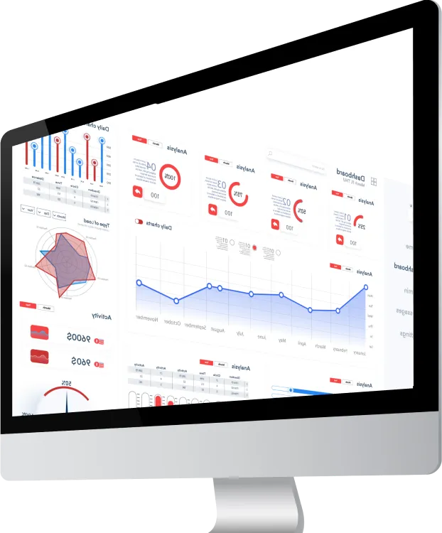
What is a landing page?
There really isn’t a translation. However, there are various formulations such as “landing page” or “target page”. A landing page is a page created for the purpose of supporting a web marketing campaign. This is the page you want people to land on.
Its purpose is to get the Internet user to fill out a form by giving his personal information and ultimately to encourage him to make a purchase. Indeed, thanks to this form that the Internet user will have completed, you will be able to collect his email and thus send him what he has filled out your form for. It can be an ebook, a subscription to a newsletter, a webinar, a discount or whatever. There are lots of different possibilities. It allows you to make your user a prospect, to encourage him to become someone more and more interested in your product or service.
Tips for an effective landing page
Go for a catchy title!
On average, 8 out of 10 people will read your headline, but only 2 out of 10 people will read the rest.
It is therefore essential to find a catchy and coherent title. The Internet user must immediately understand what it is about.
Keep it brief!
If at a glance the Internet user judges that there is too much information that does not bring him anything, he will close the page immediately. The landing page must contain all the necessary information, within reason. Do not invade it with information, at the risk of losing it. Highlight the key arguments as well as the characteristics of the offer.
Emphasize the message, not the images!
Your images should not take over. Remember that the element that should stand out the most from your landing page is the CTA: call to action. Do not hesitate to put an incentive image.
Play with colors!
Structure your landing page with colors. Create a landing page that catches the eye and makes you want to read! Emphasize the most important information.
Take into account the adaptive module
Do not hesitate to test and modify your landing page after asking yourself these simple questions:
- Does my page make you want to be read?
- Is my information clear and visible?
- Is my CTA clear and highlighted?

